Understanding the Dots in Classical East Syriac Script
East Syriac uses a sophisticated system of dots known as diacritics for pronunciation, vocalization, and grammatical understanding. This system of dots, known in Syriac as nūqze ܢܘܼܩܙܹ̈ܐ, was largely standardized by the 8th and 9th centuries. Some of these dots were originally used with Estrangela, while others are unique to East Syriac - they can be broadly categorized into three groups: vowel markers, consonant modifiers, and grammatical indicators.
This article focuses on how these dots can be distinguished visually (in manuscripts, print, and in digital fonts), and how they can be typed correctly. All key combinations mentioned are for the Syriac Phonetic keyboard. Font samples below use faces available on this site; other Meltho and Noto faces show the same marks with their own placement conventions.
The Vowel Dots
Unlike Arabic or Hebrew, or even Western Syriac which often use lines and small symbols, the East Syriac tradition primarily uses dots in specific positions and combinations to represent the seven full vowels of the language.
Zqāpā ܙܩܵܦܵܐ Shift + X
Represented by two dots placed diagonally above a letter, it produces a long ā sound, similar to the a in “father”. The dots may slant to the right or to the left.
Examples across fonts:
| Estrangela | ES Adiabene | ES Malankara | ES Malankara Classical |
|---|---|---|---|
| ܒܵܐ | ܒܵܐ | ܒܵܐ | ܒܵܐ |
Pṯāḥā ܦܬܵܚܵܐ Shift + Z
A pair of dots arranged vertically above and below a letter, it signifies a short a sound, like the a in “cat”.
Examples across fonts:
| Estrangela | ES Adiabene | ES Malankara | ES Malankara Classical |
|---|---|---|---|
| ܒܲܐ | ܒܲܐ | ܒܲܐ | ܒܲܐ |
Zlāmā qašyā ܙܠܵܡܵܐ ܩܲܫܝܵܐ Shift + N
Two dots placed diagonally below a letter; this indicates a long ē sound, as in “they”. The dots might even appear vertically.
Examples across fonts:
| Estrangela | ES Adiabene | ES Malankara | ES Malankara Classical |
|---|---|---|---|
| ܒܹܐ | ܒܹܐ | ܒܹܐ | ܒܹܐ |
Zlāmā pšīqā ܙܠܵܡܵܐ ܦܫܝܼܩܵܐ Shift + C
Two dots placed horizontally below a letter, representing a short e sound, like in “bed”. It is also known as Pṣāṣā.
Examples across fonts:
| Estrangela | ES Adiabene | ES Malankara | ES Malankara Classical |
|---|---|---|---|
| ܒܸܐ | ܒܸܐ | ܒܸܐ | ܒܸܐ |
Rwāhā ܪܘܵܚܵܐ Shift + B
A single dot placed above the wav ܘ, it produces a short o sound, similar to the o in “lot”.
Examples across fonts:
| Estrangela | ES Adiabene | ES Malankara | ES Malankara Classical |
|---|---|---|---|
| ܒܘܿ | ܒܘܿ | ܒܘܿ | ܒܘܿ |
Rḇāṣā ܪܒ݂ܵܨܵܐ Shift + V
A single dot placed below the wav ܘ, it represents a long ū sound, as in “goo”.
Examples across fonts:
| Estrangela | ES Adiabene | ES Malankara | ES Malankara Classical |
|---|---|---|---|
| ܒܘܼ | ܒܘܼ | ܒܘܼ | ܒܘܼ |
Ḥḇāṣā ܚܒ݂ܵܨܵܐ Shift + V
The letter Yōḏ ܝ with a dot underneath represents the ī sound, as in “bee”.
Examples across fonts:
| Estrangela | ES Adiabene | ES Malankara | ES Malankara Classical |
|---|---|---|---|
| ܒܝܼ | ܒܝܼ | ܒܝܼ | ܒܝܼ |
The Rḇāṣā and the Ḥḇāṣā are the same dot.
Consonant Modification Dots: Qushaya and Rukkakha
One of the most critical functions of the dots is to distinguish between the hard (plosive) and soft (fricative) pronunciations of six specific consonants, known collectively as Begadkepat letters ܒܓܕܟܦܬ.
Qushaya ܩܘܼܫܵܝܵܐ (“hardening”) Shift + U
Qushaya is a dot placed above a letter indicating its hard, plosive sound (b, g, d, k, p, t). Notice how in the table below, the dot sometimes appears to the right side of the character and sometimes directly above it - this is a stylistic choice rather than an orthographic rule. Placing the dot to the side lessens the chance of overlap with other diacritical marks. In both manuscripts and print, these dots most commonly appear directly above the characters. If you want the Qushaya to appear directly above the character, choose an appropriate font rather than using the supralinear dot to achieve the same effect.
Example: ܒ݁ (b), ܓ݁ (g), ܕ݁ (d), ܟ݁ (k), ܦ݁ (p), ܬ݁ (t).
| Letter | Estrangela | ES Adiabene | ES Malankara | ES Malankara Classical |
|---|---|---|---|---|
| Beth | ܒ݁ | ܒ݁ | ܒ݁ | ܒ݁ |
| Gamal (terminal non-joining) | ܓ݁ | ܓ݁ | ܓ݁ | ܓ݁ |
| Gamal (terminal joining) | ܓ݁ | ܓ݁ | ܓ݁ | ܓ݁ |
| Gamal (medial) | ܓ݁ | ܓ݁ | ܓ݁ | ܓ݁ |
| Dalath | ܕ݁ | ܕ݁ | ܕ݁ | ܕ݁ |
| Kap (terminal non-joining) | ܟ݁ | ܟ݁ | ܟ݁ | ܟ݁ |
| Kap (initial) | ܟ݁ | ܟ݁ | ܟ݁ | ܟ݁ |
| Kap (terminal joining) | ܟ݁ | ܟ݁ | ܟ݁ | ܟ݁ |
| Pe | ܦ݁ | ܦ݁ | ܦ݁ | ܦ݁ |
| Taw | ܬ݁ | ܬ݁ | ܬ݁ | ܬ݁ |
Rukkakha ܪܘܼܟܵܟ݂ܵܐ (“softening”) Shift + M
A dot placed below the letter indicates its soft, fricative sound (v, gh, dh, ḥ, f, th/s). As with the Qushaya, the Rukkakha also appears below and to the right side of characters in certain fonts, and right below the character in others - this is a stylistic choice of the font makers rather than an orthographic rule, primarily to prevent overlap with vowel points if they exist together.
Example: ܒ݂ (v), ܓ݂ (gh), ܕ݂ (dh), ܟ݂ (ḥ), ܦ݂ (f), ܬ݂ (th/s).
| Letter | Estrangela | ES Adiabene | ES Malankara | ES Malankara Classical |
|---|---|---|---|---|
| Beth | ܒ݂ | ܒ݂ | ܒ݂ | ܒ݂ |
| Gamal (terminal non-joining) | ܓ݂ | ܓ݂ | ܓ݂ | ܓ݂ |
| Gamal (terminal joining) | ܓ݂ | ܓ݂ | ܓ݂ | ܓ݂ |
| Gamal (medial) | ܓ݂ | ܓ݂ | ܓ݂ | ܓ݂ |
| Dalath | ܕ݂ | ܕ݂ | ܕ݂ | ܕ݂ |
| Kap (terminal non-joining) | ܟ݂ | ܟ݂ | ܟ݂ | ܟ݂ |
| Kap (initial) | ܟ݂ | ܟ݂ | ܟ݂ | ܟ݂ |
| Kap (terminal joining) | ܟ݂ | ܟ݂ | ܟ݂ | ܟ݂ |
| Pe | ܦ݂ | ܦ݂ | ܦ݂ | ܦ݂ |
| Taw | ܬ݂ | ܬ݂ | ܬ݂ | ܬ݂ |
Notice how the Rukkakha dot overlaps with Dalath’s dot ܕ݂, with Gamal’s tail ܓ݂, and with the terminal joining Kap ܟ݂ in the East Syriac Adiabene font - this is a (arguably bad) font design decision.
The presence or absence of these dots is governed by strict phonological rules, often related to the letter’s position in a word or whether it follows a vowel. For example, the word for “king” is malkā ܡܲܠܟ݁ܵܐ with a hard k, but “his king” is malkēh ܡܲܠܟ݂ܹܗ with a soft ḥ sound. However, since the modern pronunciations of soft and hard versions of some letters are quite similar (e.g. Gamal, Dalath, Pe), these dots are omitted quite often.
Grammatical and Other Dots
Beyond vowels and consonants, dots serve other essential purposes:
Syāmē ܣܝܵܡܹ̈ܐ (“placings”) Shift + I
This is arguably one of the most distinctive features of the Syriac script. A pair of dots placed horizontally above a letter, known as the Syāmē, indicates that a noun is plural. It does not affect pronunciation but is a purely grammatical marker. It can also mark duals and some collective nouns. These dots are also called “Combining Diaereses”.
Example: ܡܲܠܟܵܐ (malkā, king) vs. ܡܲܠܟܹ̈ܐ (malkē, kings).
Sublinear / Supralinear points
Before the current system of East Syriac vocalisation (using the vowels and Rukkakha and Qushaya mentioned above) was developed, sublinear (below the line) and supralinear (above the line) points were used to distinguish homonyms (words which have the same spelling, but different pronunciation). These dots are also used as morphological markers to distinguish verbs.
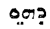
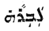
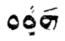
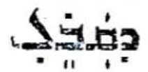
These dots are usually placed directly above or below the consonant before the vowel sound, and sometimes between two letters (in manuscripts as well as in old printed texts). Modern fonts, however, place these dots exclusively directly above or below a letter, and never in between letters.
- Supralinear dot - ܗ̇ Shift + P - also known as “Combining Dot Above”
- Sublinear dot - ܗ̣ Shift + ; - also known as “Combining Dot Below”
- ܥ̣ܒܕܐ (ܥܲܒ݂ܕܵܐ) ‘slave’ and (ܥܵܒ݂ܕܵܐ) ܥ̇ܒܕܐ ‘she makes’.
- (ܣܸܦܪܵܐ) ܣ̣ܦܪܐ ‘book’ vs. (ܣܵܦܪܵܐ) ܣ̇ܦܪܐ ‘scribe’.
- (ܗܸܢܘܿܢ) ܗ̣ܢܘܢ ‘these’ vs. (ܗܵܢܘܿܢ) ܗ̇ܢܘܢ ‘those’.
- (ܡܲܠܟܵܐ) ܡ̇ܠܟܐ ‘king’ vs. (ܡܸܠܟܵܐ) ܡ̣ܠܟܐ ‘advice’.
- ܡ̇ܢ ‘who’ vs. ܡ̣ܢ ‘from’.
- (ܗܵܘ) ܗ̇ܘ ܗܘ̇ ‘that MASC’ vs. (ܗܘܼ) ܗܘ̣ ‘he’.
- (ܗܵܝ) ܗ̇ܝ ܗܝ̇ ‘that FEM’ vs. (ܗܝܼ) ܗܝ̣ ‘she’.
In East Syriac, a pronounced ܗ is marked with two sublinear points as in ܗ̤ܘܐ /hwā/, ܗ̤ܘ /hū/ ‘he’, and ܗ̤ܝ /hī/ ‘she’, while a silent ܗ takes one sublinear point in enclitic ܗ̣ܘܐ /wā/, ܗ̣ܘ /ū/, and ܗ̣ܝ /ī/. The two sublinear points can be typed using Shift + K (Combining Diaereses Below).
- The supralinear point is also used on the feminine ܗ ending - ܟܬܒܗ̇ ‘she wrote’.
- These points can also be used to mark tense - e.g. present tense ܟ̇ܬܒ ‘he is writing’, past tense ܟ̣ܬܒ ‘he wrote’, etc.
- The diacritic used to denote the third person feminine verb is two points under the terminal taw in East Syriac, e.g. ܟܬܒܬ݀ ‘she wrote’. The same, however, is a single dot above the taw in West Syriac as well as in Estrangela, e.g. ܟܬܒܬ݀ - it is available at Shift + Y.
The feminine marker and Combining Diaereses Below may look similar, but they are not the same character - using one in place of the other would result in incorrect behaviour when the font is changed.
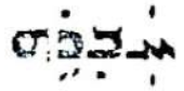
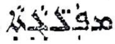
Print examples
Common errors
Using supra/sublinear points instead of Qushaya/Rukkakha
This is very common in digital text which has not been professionally edited. A few people seem to have the incorrect notion that the Rukkakha/Qushaya need to always appear directly above/below a letter, and end up using the wrong dots for them (instead of using an appropriate font).
- ܐܲܒ݂ܵܐ is correct, ܐܲܒ̣ܵܐ is incorrect.
- ܒܹܝܬ݂ is correct, ܒܹܝܬ̣ is incorrect.
- ܡܲܪܬ݁ is correct, ܡܲܪܬ̇ is incorrect.
Using the vowel point instead of Qushaya/Rukkakha
Fairly common error in digital text obtained via OCR (Optical Character Recognition).
- ܐܲܒ݂ܵܐ is correct, ܐܲܒܼܵܐ is incorrect.
- ܐܲܝܟ݂ is correct, ܐܲܝܟܼ is incorrect.
- ܒܹܝܬ݂ is correct, ܒܹܝܬܼ is incorrect.
- ܡ̣ܢ is correct, ܡܼܢ is incorrect.
Using Qushaya/Rukkakha instead of supra/sublinear points
- ܡ̇ܢ is correct, ܡ݁ܢ or ܡܢ݁ are incorrect.
- ܡ̣ܢ is correct, ܡ݂ܢ or ܡܢ݂ are incorrect.
For a detailed treatment of the various marks used in Syriac, please refer to [1].
References
- George Kiraz, Syriac Orthography (A Grammar of the Syriac Language, Volume 1), Gorgias Press, 2012.
- Guide to Meltho Fonts, Beth Mardutho Syriac Institute.
- Richard Ishida, Classical Syriac Orthography Notes.